A software developer who is particularly good at turning strong design and business requirements into finished products.
Global Satellite Solutions
- My role
- Designer and sole developer, at Lumios Digital.
- What I delivered
- A hand-written WordPress theme with no build step: a sequenced homepage with animated statistics, dedicated Aviation and Telecom pages, a news system with AJAX load more, and a demo request that emails both the sales team and the requester.
- Why it mattered
- Almost nobody who matters visits a B2B site like this, and one procurement conversation is worth more than a month of traffic. The build protects the handful of enquiries rather than optimising a funnel that does not exist.
- Current status
- Live since 2025, maintained through to the studio winding down.
Scope
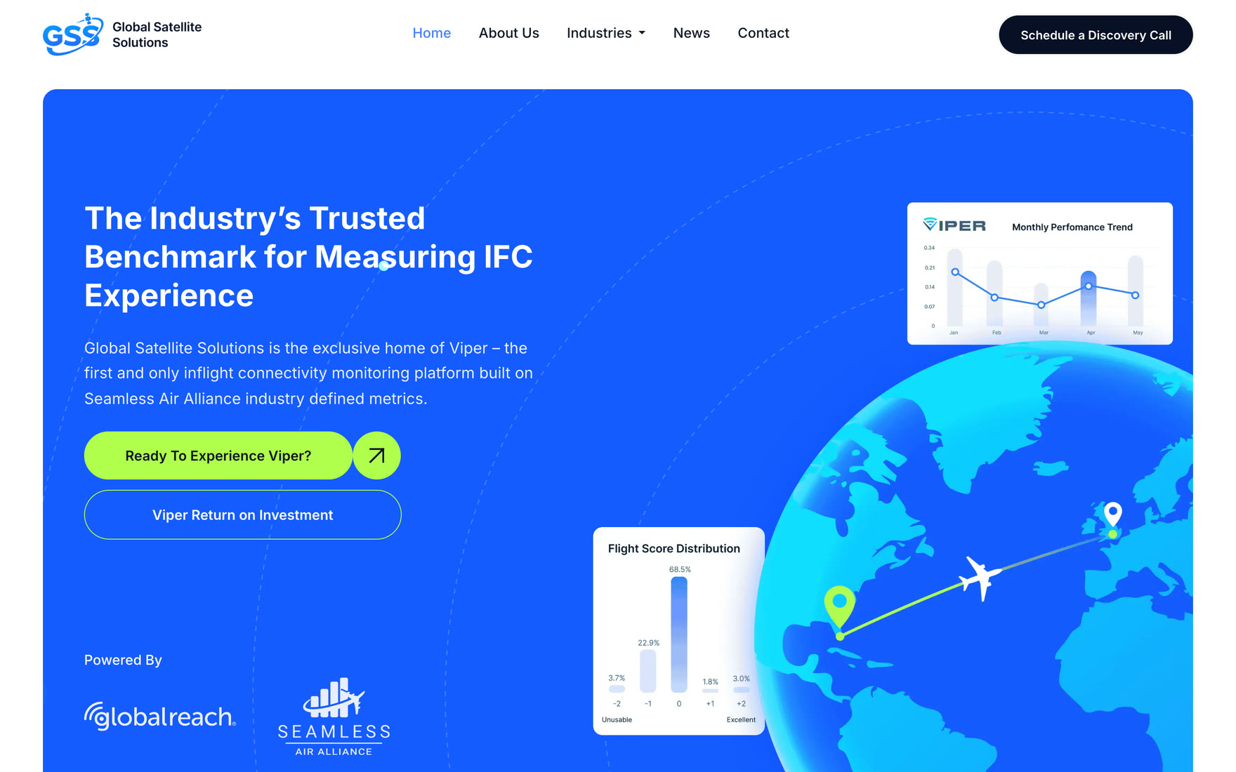
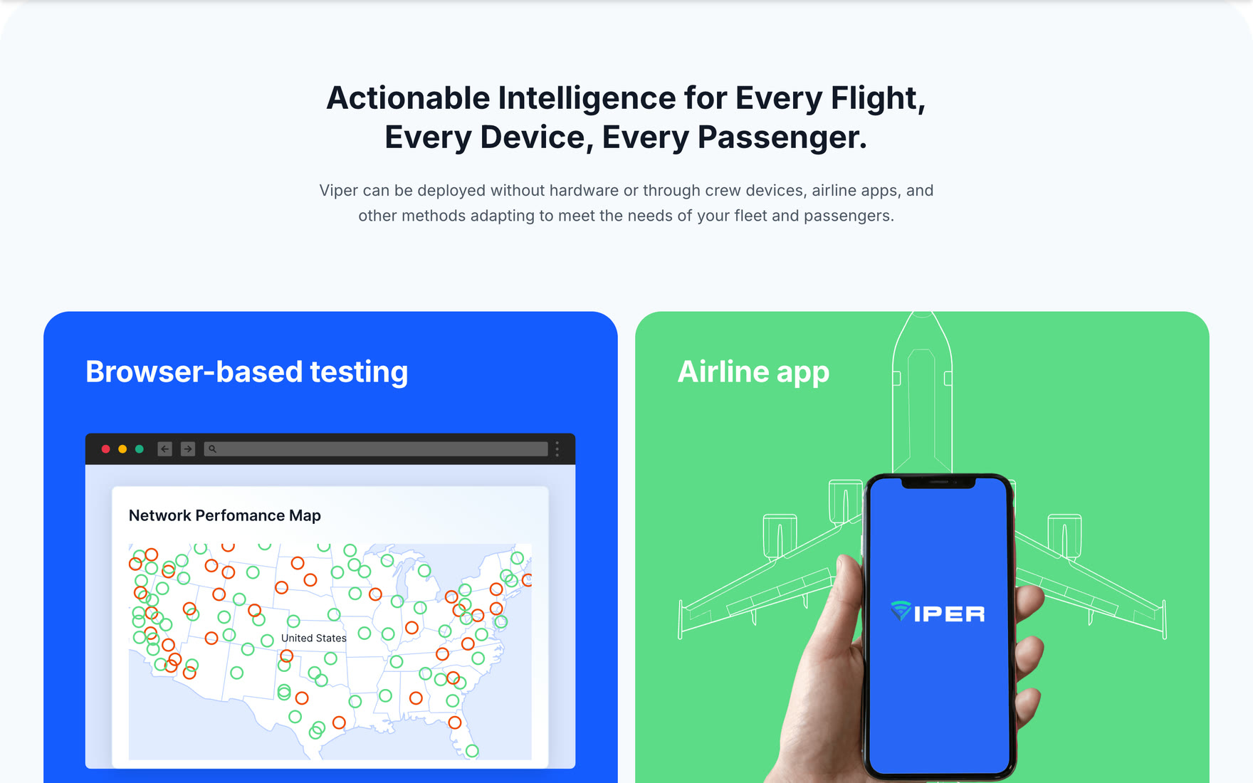
Global Satellite Solutions makes Viper, a monitoring product for inflight connectivity. It measures satellite quality of experience against Seamless Air Alliance industry metrics and surfaces antenna alignment problems, signal degradation and interference, without needing hardware installed on the aircraft.
The site sells that to airlines, satellite operators and telecom providers. I designed it and built the theme, at Lumios Digital: a hand-written WordPress theme, no build step, plain PHP templates with per-feature stylesheets and vanilla JavaScript.
The opposite of an ecommerce problem
A store wants many visitors and converts a small fraction of them. This site wants the reverse. Almost nobody who matters will ever visit it, and the ones who do are procurement and engineering people at airlines evaluating whether a vendor is credible. A single one of them turning into a conversation is worth more than the entire month of traffic.
That changes what the build is for. There is no funnel to optimise. There are two jobs: explain a technical product without either dumbing it down or drowning the reader, and make absolutely certain that the handful of people who raise their hand are not lost.
Explaining the product
The homepage is built as a sequence rather than a set of blocks: what the problem is, what inflight connectivity involves, an airline case study, what the data shows, what to do about it, and only then the invitation to see the product.
The statistics animate as they scroll into view, counting up rather than appearing finished, which gives a reader a reason to stop on the number instead of skimming past it. The effect is driven by an intersection observer rather than a scroll handler, so it costs nothing while the page is idle.
Not losing the enquiry
The demo request is the entire commercial point of the site, so it is the part built most carefully. The submission is nonce verified and every field sanitised before anything is sent, and the email address is validated rather than assumed.
It then sends two messages. A formatted notification to the sales team, with reply-to set to the requester so a response is one click rather than a copy and paste. And a plain text confirmation straight back to the person who filled it in.
That second email is the one people skip. An airline executive who submits a form and hears nothing does not assume the message is in a queue, they assume the site is broken and the vendor is unserious. Confirming receipt immediately costs one function call and protects the only conversion that matters.
A site that cannot half-exist
Two smaller decisions come from the same instinct. The pages the site depends on, news and the legal pages, create themselves if they are missing rather than 404ing, and navigation falls back to a sensible menu if none has been assigned.
Neither is clever. Both mean that a client who logs in and changes something cannot accidentally leave the site in a state where a prospect hits a dead end.
Also in the build
- Dedicated Aviation and Telecom pages for the two markets, each with its own scoped stylesheet
- News system with AJAX load more, author overrides, and per-post display toggles
- Homepage featured-post flag so news can be surfaced without editing templates
- Desktop-only parallax on the features section
- About, contact and three legal templates
Status
Live since 2025 and maintained through to the studio winding down.